Apr 29, 2019 · newsletter
Visualizing Active Learning
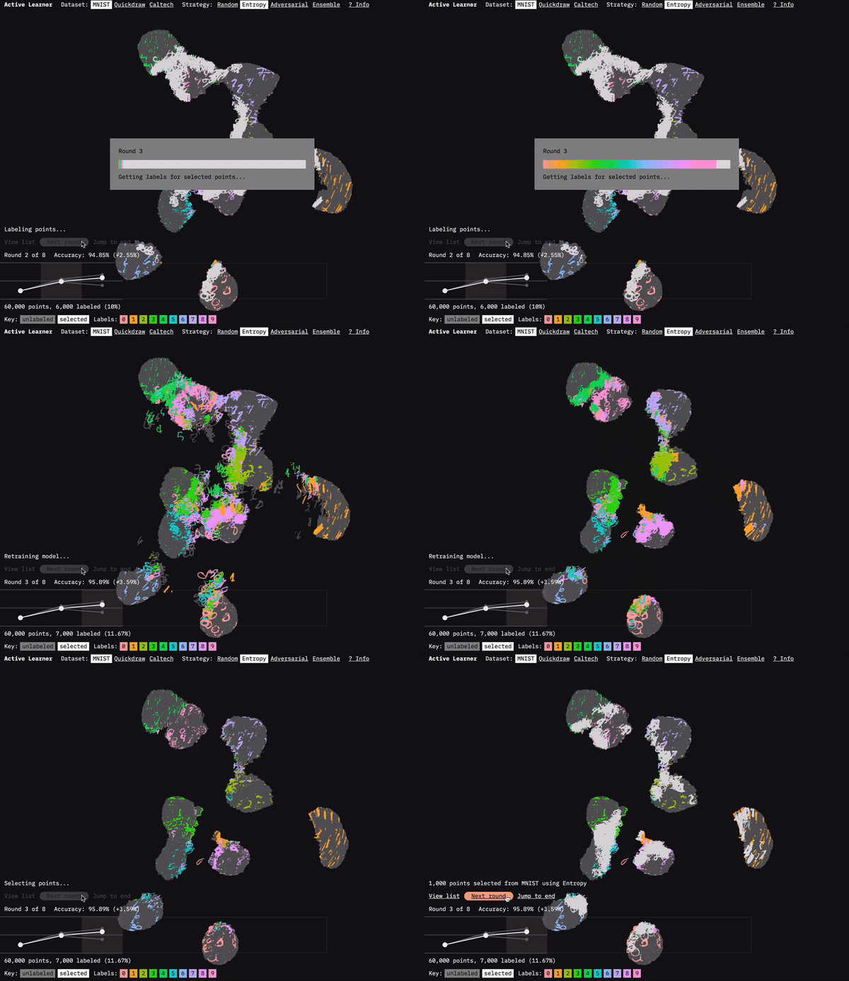
Active Learner shows how active learning selects which data to be labeled.
Active Learner, our new research prototype, is an interactive visualization of different active learning strategies for labeling data. It features three different datasets (MNIST, Quickdraw, and Caltech) and four different data selection strategies (Random, Entropy, Adversarial, and Ensemble). By exploring the different datasets and strategies, you can build your intuition about how and why active learning works. (For more on the selection strategies, read our report Learning with Limited Labeled Data.)
In this newsletter, I’m going to focus on the visualization challenges involved in the prototype.
Show me the data
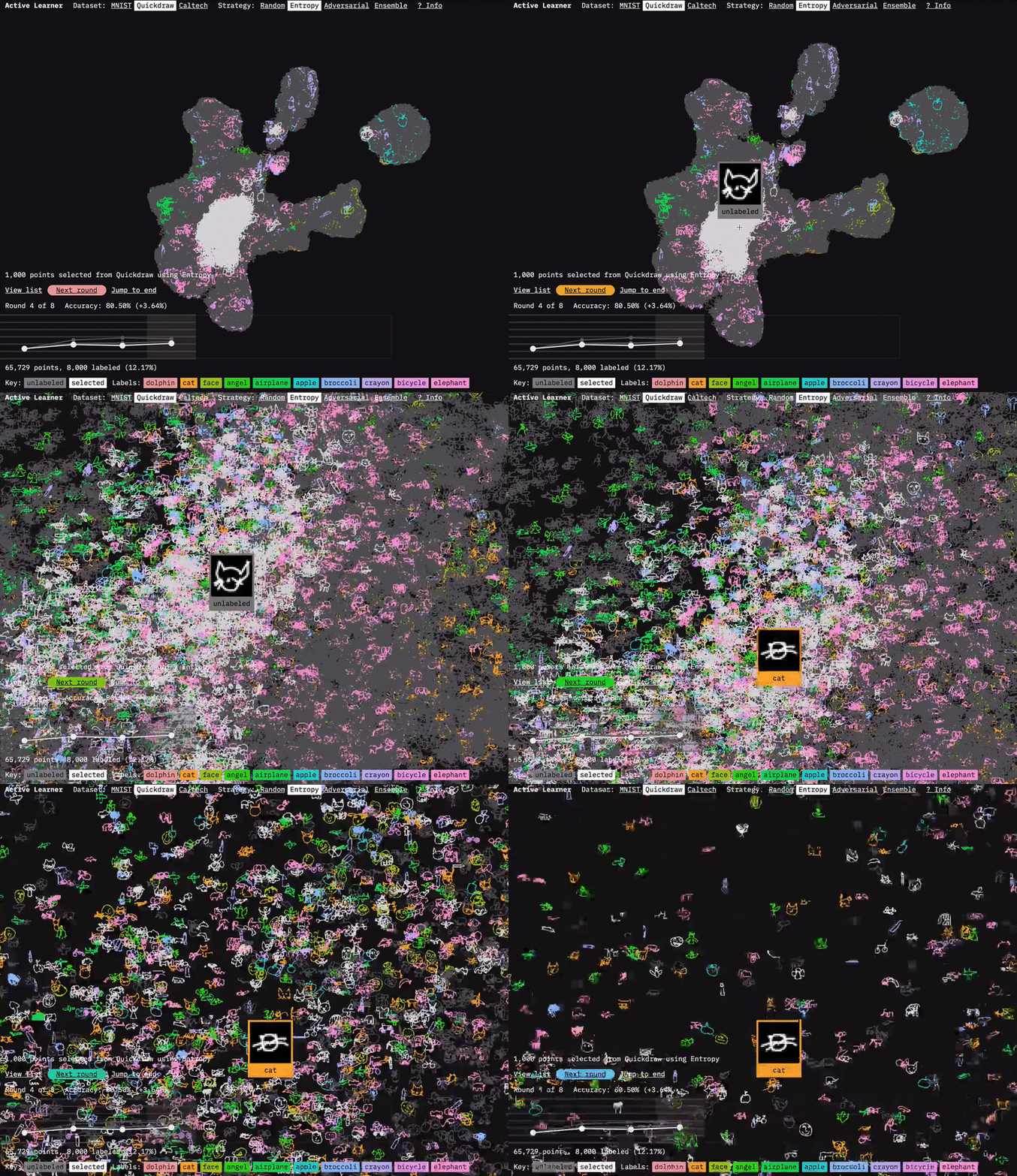
I used sprite sheets and shaders to display the image for each of the data points.
One of the main challenges involved in visualizing machine learning processes is figuring out how to present the vast amount of data involved. For Active Learner, we used the dimension-reduction algorithm UMAP to visualize how the model clusters the dataset. We ran UMAP on the embeddings generated by our model after each round of data selection and training. As you move through the rounds in the prototype, you can see how the active learning strategies focus on points at the boundaries of the clusters. This focus makes sense because it is at the boundaries between classifications that there is often the most uncertainty. They are (kind of literally) the edge cases.
UMAP gets us the coordinates to plot the data, but displaying all those points in a browser is another challenge. For the UMAP dataset, we’re displaying 60,000 points. That’s a lot for a browser to handle when you want to be able to zoom and pan the visualization. I’d previously taken on this challenge for our FF07 prototype: Deep Bargain Book Shop. In that prototype, we used a different dimension-reduction algorithm (T-SNE) to visualize book description similarity for recommendations. I’d turned to the JavaScript library three.js to display those. Because three.js uses WebGL, it can smoothly render more points than approaches like SVG or vanilla HTML canvas. (I wrote about that approach in an Observable notebook: Using three.js for 2D data visualization.)
In this prototype, I saw an opportunity to take another crack at building an interactive large scale visualization. I wanted to take this one even further. Since this project is focused on image datasets, I wondered if I could plot the images themselves (rather than placeholder circles). Based on my past experience with three.js, and from following people online who do similar work, I believed I could – but I wasn’t certain (which is, after all, what makes it fun).
UMAP Explorer
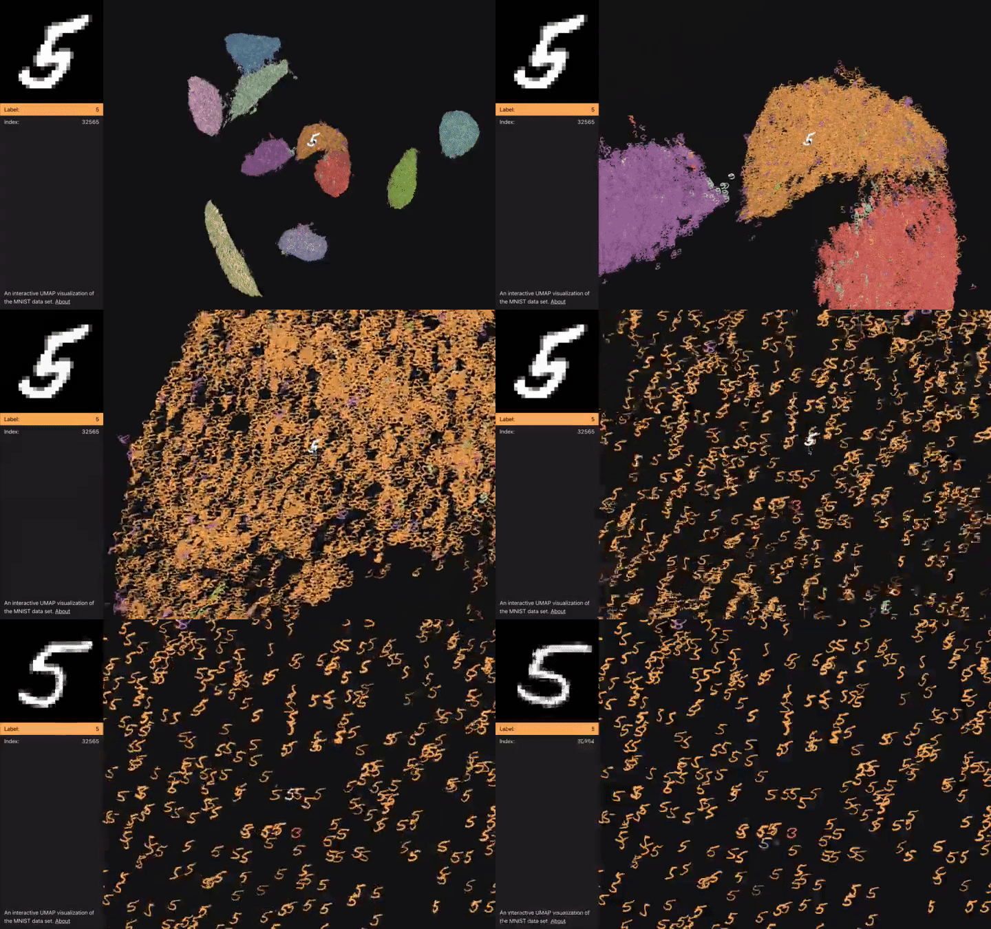
In UMAP Explorer I worked out the image rendering techniques used in the prototype.
While Shioulin and Nisha worked on the model and selection strategies, I explored visualization rendering techniques with UMAP Explorer, an interactive UMAP visualization of the MNIST dataset, and a trial run for the techniques I wanted to use in the prototype. I hit the wall a few times trying to get all 70,000 images to render. I eventually found a way to swing it, thanks mostly to a stack overflow answer by WestLangley, and a post on a similar project by Douglas Duhaime.
The solution was to borrow a technique from video games and create a sprite sheet of the images all stitched together. You can then use a shader to pick what parts of the sprite sheet to display for each point. This gets you a huge performance improvement compared to loading a separate image for each point. I also explored different transparency and color coding options in UMAP explorer. Gradated transparency was too slow, so instead the shader just discards any pixels below a certain brightness level. This works fine for the black and white digits of MNIST, but needs to be adjusted depending on the images.
Transitions
With the knowledge gained from UMAP explorer, I jumped into the prototype itself. The new challenge that emerged was how to maintain continuity between rounds. The answer was to use transitions, so that the data points move to their new transitions from round to round. I found several examples using tween.js to transition three.js points, and was able to implement that approach.
The bigger issue was how to manage state. I used React to structure the app, and its system of state management was a big help in keeping organized, but things still got pretty hairy when I got into the multi-step transitions. Initially I gave the user control of when to move through each step of a round (selection, labeling, retraining), which greatly increased the number of transitions I had to prepare for (what if they changed datasets after the labeling set?), so I scaled it back by changing all the steps in a round together. It worked out, but I wouldn’t mind another crack at this in a future prototype.
Links
- Active Learner
- UMAP Explorer
- A screenshot design history of Active Learner
- My Twitter thread about Active Learner

