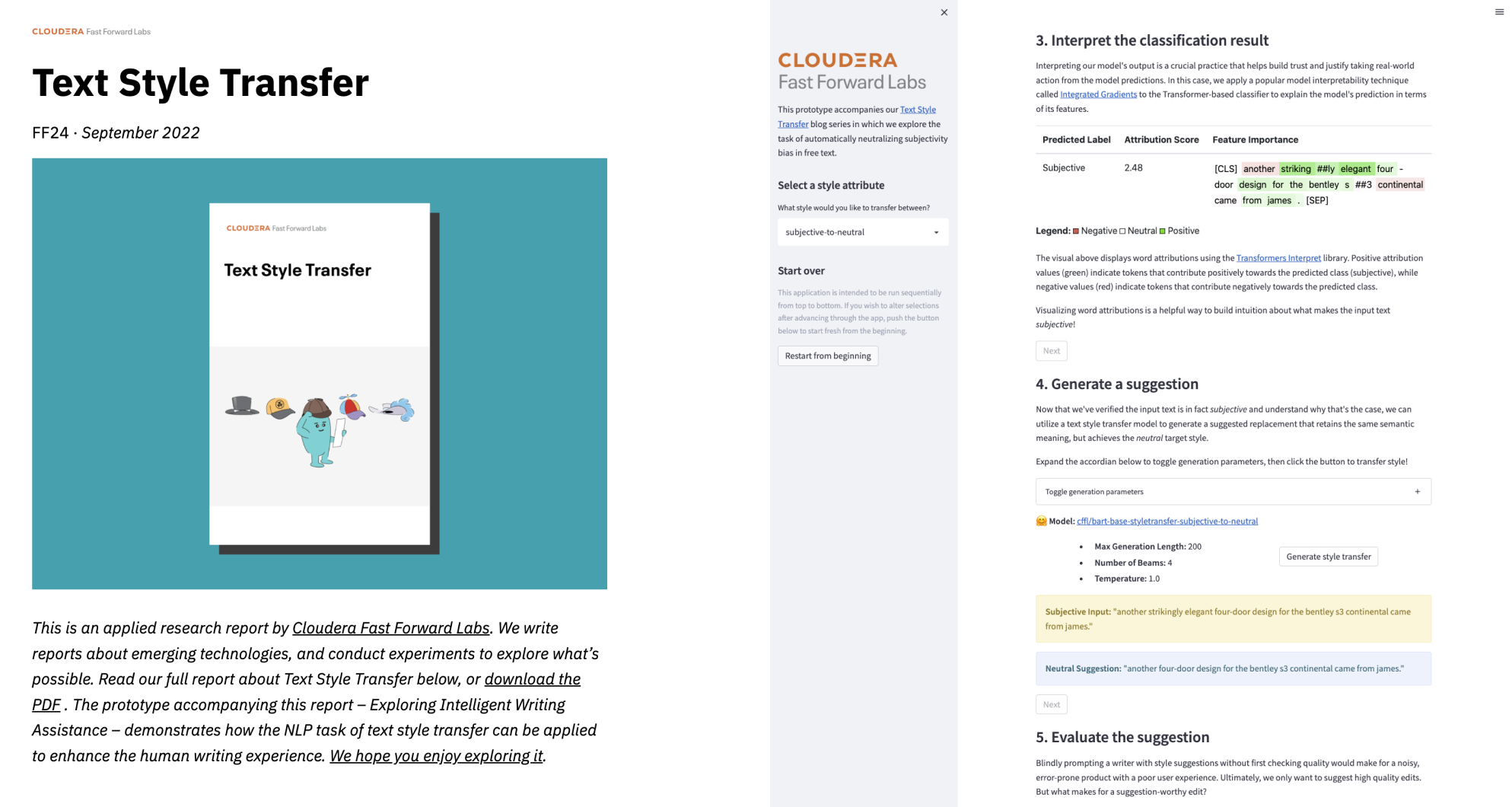
Feb 20, 2020 · post
Building Blip: behind the scenes of our anomaly detection prototype
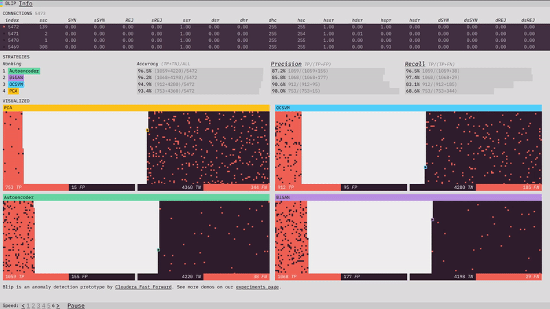
Our anomaly detection prototype, Blip, shows how four different algorithms perform at detecting network attacks. Here is a look at some of the design, visualization, and front-end programming decisions that went into it. (For more on the algorithms themselves, check out the prototype section of our report.)
Tomato sorting
The concept of an anomaly is easy to visualize: it’s something that doesn’t look the same. The conceptual simplicity of it actually makes our prototype’s job trickier. If we show you a dataset where the anomalies are easy to spot, it’s not clear what you need an algorithm for. So instead, we want to place you in a situation where the data is complicated enough, and streaming in fast enough, that the benefits of the algorithm are clear.

But what does that look like? We took some inspiration from a viral youtube video of a machine sorting tomatoes by color at an incredible speed. The video is mesmerizing to watch, and it makes its point clearly: a human definitely can sort green tomatoes from red ones, but not at anything close to that speed.
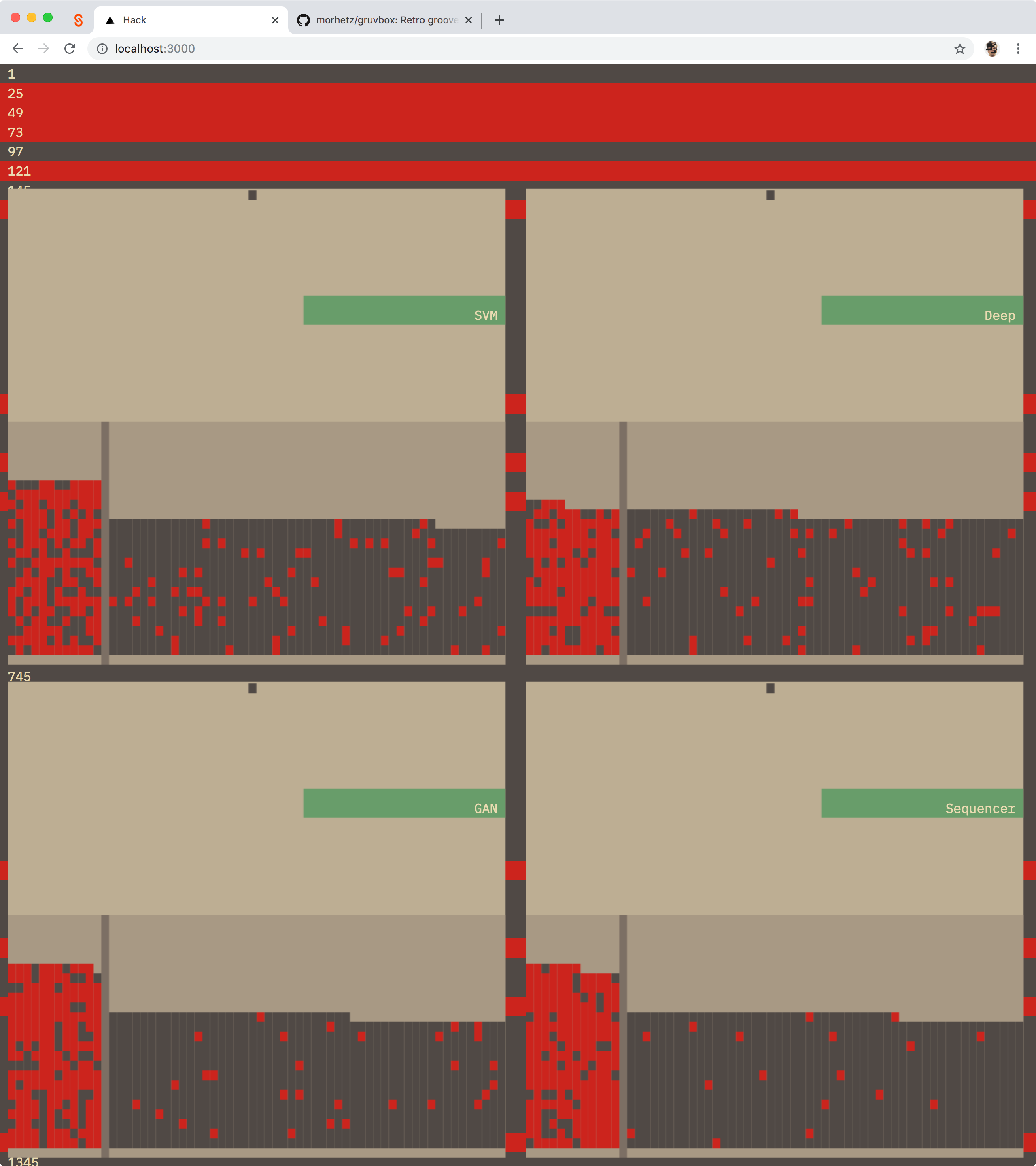
An early version of the prototype with tomato-sorter inspired levers
So we thought, what would it look to visualize each algorithm’s classification at a really fast speed? We had worked in a similar realm with Turbofan Tycoon, our federated learning prototype which visualizes the success of different algorithms at predictiong image failure. In early versions of Blip, I experimented with an animation that mimicked the tomato sorter motion – a tiny lever that knocked data classified as anomalous outside of the ‘good data’ bucket. Ultimately, I dropped the animation for performance reasons.
I’ll talk more about performance later. Let’s talk about continuity next.
Continuity
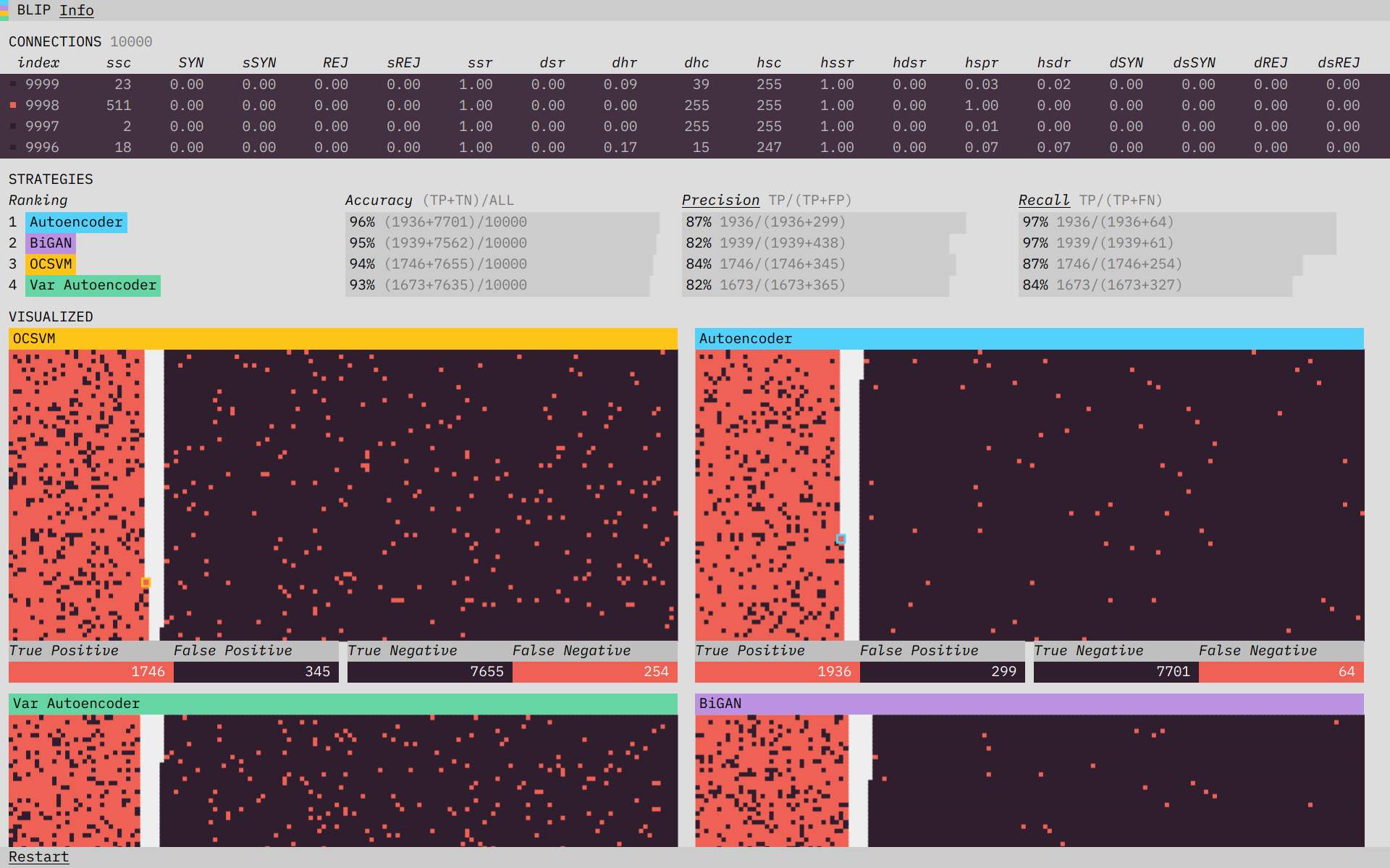
Blip features three different sections, with the data synced across all three.
In the final prototype, there are three sections. “Connections” shows the data streaming in, “Strategies” shows performance metrics for each of the algorithms, and “Visualized” visualizes the performance on each piece of data. One of the core concepts of the prototype is that the data is in sync across all of these sections. Having the data be in sync and visibly updating everywhere was our main strategy for establishing continuity across the sections: communicating to the user that the data was the same everywhere, and that the difference in the algorithm visualizations is a product of the difference in their classification performance.
As I mentioned above, I initially attempted to use animation to establish continuity between the data. Continuity is one of the things animation is best at, and I still believe that something which showed each piece of data directly flowing from the connections into each algorithm’s visualization, where it is then acted on by a sorting mechanism, would be a strong illustration of the process. Design is a series of trade-offs, however, and I judged the complexity that would be necessary for animating across the sections (which have to work across different screen sizes and therefore layouts) to not be worth it for this case. Instead, I focused on speed and on simplifying all the visual elements (like the color scheme, and the left-right classification system) to help guide the user into seeing the continuity (connecting the dots themselves).
Once I had decided to forgo complex animations, I leaned harder on one of the other inspirations for the prototype: terminal applications, where quickly updating numbers and animation restricted to a character grid are put to creative use. I was also inspired by the process of inspecting and debugging programs. You can pause the simulation to inspect the current state, and from there step through it one “tick” at a time. By doing that you can verify that the newest connection is classified in each visualization immediately as it appears (and that the totals in the performance metrics reflect that).
One place where I did end up adding more complex animation back in was in the strategy ranking. I used a package called react-flip-move to animate changes in the rankings. Seeing the rankings move, rather than just appear immediately in their new spot, makes it much easier to parse what changes are happening.
Visualizing classification
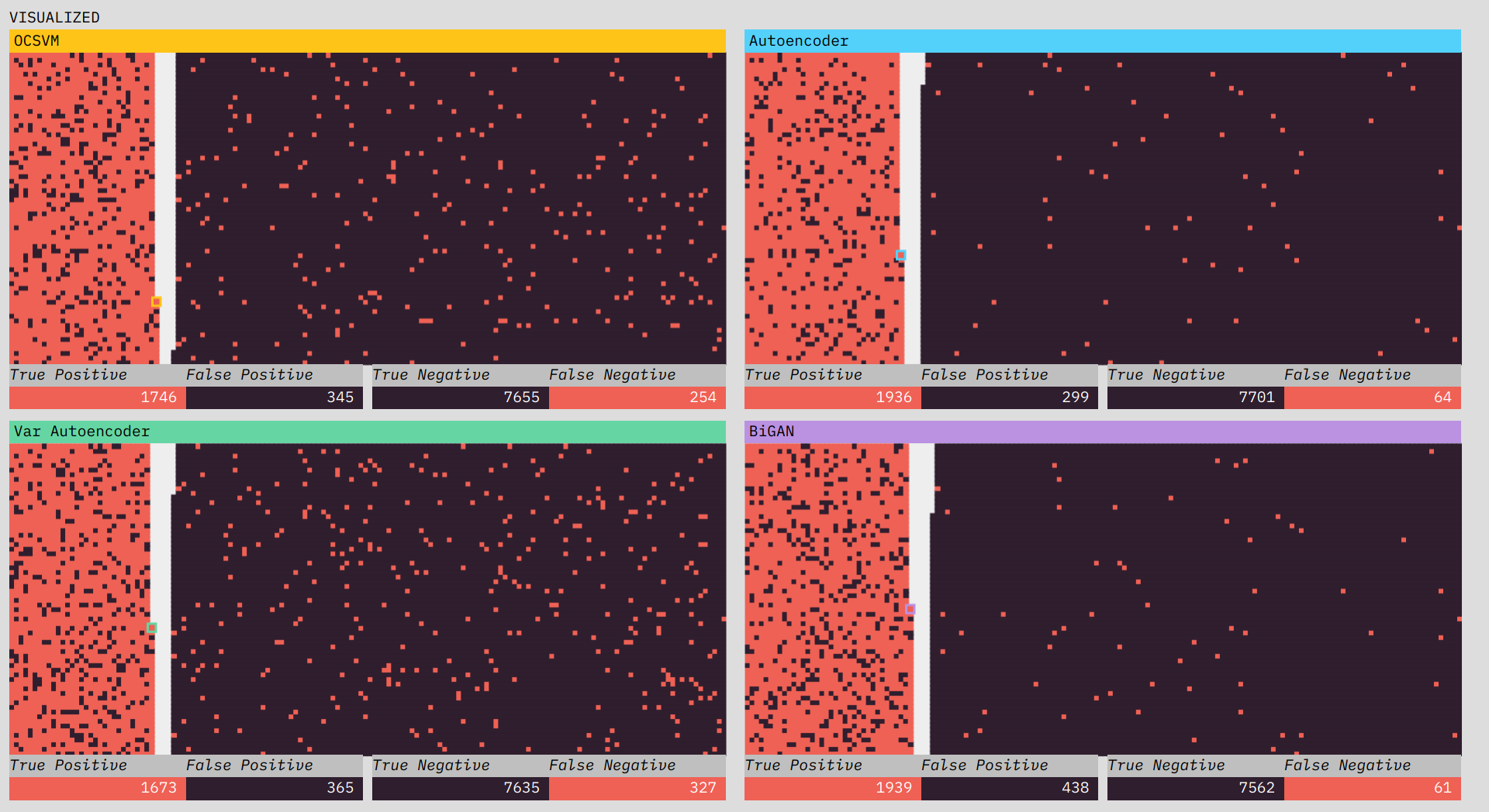
The visualizations show the classification performance of each of the algorithms.
One of the most interesting challenges in the prototype was figuring out how I wanted to spatially visualize the classifications. From early on I thought I wanted two piles, one of positive classifications and one of negative, with the truth shown through color. I initially thought I would place a divider between the two sections, but there I ran into a subtle problem. I wanted all of the data to fit in the visualization (I didn’t want to have to adjust the layout half-way through the simulation to fit data still coming in). This wasn’t too much of a problem; since I knew we were going to use 10,000 data points, I just needed to make sure the starting area was larger than 10,000.
The problem was the divider. If I put a vertical divider between the positive and negative classifications I would be telegraphing the balance of the classifications at the start of the simulation and ruining any suspense. The solution turned out to be obvious in retrospect. There is no divider, and each classification side builds from the outside in, so that the balance of the division only becomes visible at the end.
Performance
Part of building Blip was making sure it could run all of these updates really fast and in sync. For the front-end I used the React library, and the visualizations are drawn using the canvas element (canvas is generally faster than drawing/animating HTML elements). React and canvas have different update models which makes using them together… interesting. It’s something I’ve done a few times now, so I came in with a gameplan.
The tick counter state lives in React; each tick (watched using React useEffect hooks) triggers new calculations, and the results of those calculations are drawn to the canvas element. Where things get a bit Frankenstein-y is in the mix of text and visual updates. Canvas is not great at text. It doesn’t do text-wrapping by default and unless you’re very careful the text comes out blurry. What I ended up doing was rendering the text as DOM elements overlaid on top of the canvas illustrations. This works, but means a lot of my layout logic is duplicated between canvas (where it is basically just pixel math) and the DOM (where I have access to CSS layout stuff). Everytime I end up in this situation, I think I should just bite the bullet and do everything in canvas. Even though it would mean more work up front it would result in less mental overhead as the project evolves. But, as I think I mentioned, design is about trade-offs, and I didn’t have time to nail down a pure canvas approach this time. So it is a (working!) mish-mash of DOM and canvas. At least the recent innovation of React hooks made the update logic a lot cleaner for me this round.
(That is the very abbreviated version of my thoughts on React and canvas, if you want to hear more about, or have specific questions just let me know (@grantcuster on Twitter or email).)
Check it out
Be sure to try Blip - and read more about its making (including the algorithms) and all things deep learning for anomaly detection in our report.