Dec 6, 2018 · post
Designing Turbofan Tycoon
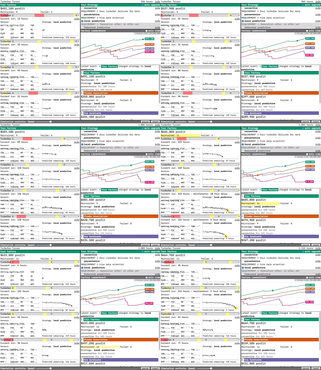
Our prototypes are designed to demonstrate the value of the technologies we research. For our most recent prototype, Turbofan Tycoon, we decided that the best way to demonstrate the value of federated learning was to place you in an interactive simulation where you’re in charge of maintaining four turbofan engines. In this post, I’m going to try and explain a bit about why we decided that, and focus on the interaction design. (If you’d like more information about federated learning in general and the predictive models in the prototype, you can find it in this post.)
The simulation decision
Let’s fast forward to the point where we’ve already decided on our use case: predictive maintenance - and our data: the venerable turbofan engine degradation simulation data set. We’ve trained local and federated predictive models, and we can prove that the federated model makes more accurate predictions about when a turbofan will fail. Now our challenge is how to communicate that fact to a prototype user in a form more visceral than a series of static graphs.
Our solution was to make the prototype a competitive simulation. We did this for the drama. By playing out a turbofan’s run, hour-by-hour, we put you in the middle of the action. You’re in charge of choosing the strategy for when your turbofans are maintained, and the effectiveness of that strategy determines your factory’s profit. By tying strategy effectiveness to your simulated livelihood, we make you an engaged participant rather than a passive observer. You care about federated learning because it’s going to be your edge over your competitors.
At the dataset level, the simulation works by selecting a new random turbofan from the dataset each time maintenance is performed or failure occurs. The random selection gives the simulation a realistic variety: some turbofans break down after a few hours of use, while others last over 300 hours”. The law of large numbers means that, over enough time, each strategy’s effectiveness will reveal itself. But, just like in life, streaks of good or bad luck can make a maintenance strategy look more or less effective than it actually is (if a factory using the corrective strategy gets a lucky streak of long-lasting turbofans, for example). Ultimately we decided the drama of the simulation was worth the potential of temporarily misleading results, especially because it contains a real-world lesson: if your competitor takes the lead with a subpar strategy, don’t panic! Stick with what you know is effective, and over time you’ll win out.
Simulation influences
One challenge we faced with Turbofan Tycoon is that, though a great example of a business application of federated learning, preventative maintenance is not necessarily everyone’s idea of an exciting or approachable topic. We could have tried to run away from its inherent nerdiness, but instead we decided to lean into it.
We found inspiration in the simulation video game scene, which has proven that, presented in the right way, lots of niche technical topics can be a source of entertainment. The title itself is a nod to RollerCoaster Tycoon. In terms of showing a bunch of gauges and instrumentation, I was thinking of Microsoft Flight Simulator, and for oddly compelling specificity I was thinking of Euro Truck Simulator.
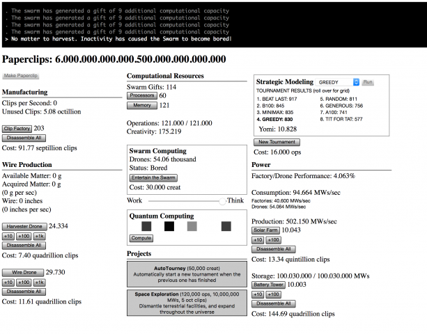
Universal Paperclips was the biggest influence on Turbofan Tycoon.
Turbofan Tycoon’s single biggest influence was Universal Paperclips, an incremental game that is also, incredibly, a parable about artificial intelligence. It starts with a simple mechanic and layers increasingly baroque modules on top of it, anchored throughout by the counter signifying your paperclip production.
What was most fascinating to me about Universal Paperclips was how even though it evolves to a point where you’re in the middle of this complex, fast moving system, you still feel like you understand what’s driving it. Part of that is the masterful way it builds complexity as it goes. Another part is how responsive everything is. When you make a change, or when a certain threshold is passed, the effect is displayed immediately. This lets you build up a mental model of what is going on, and then you can go in and tweak stuff and see if it works the way you thought it did, and reassess. Being able to always refer to your paperclip total (even as the total becomes absurd) provides a degree of consistency even as the methods of your production become increasingly absurd.
In Turbofan Tycoon, your factory’s profit is our analog to the paperclip total. We wanted that to be something you could always refer back to, in combination with your competitor’s profits, to see how your selected strategy was doing. Turbofan Tycoon never reaches the complexity of later stage Universal Paperclips, but it does show a lot of data moving pretty fast. We used the layout to provide as much structured consistency as possible, both to make the fast-moving data more approachable and to make the dynamism of the moving parts pop even more through contrast. We wanted to provide an experience where you felt like you were peeking under the hood of a complex system. Some initial confusion was acceptable, as when you first approach a puzzle. We just needed to make sure that there were enough clues there for you to want to dig in further rather than bounce out.
Simulation aesthetics
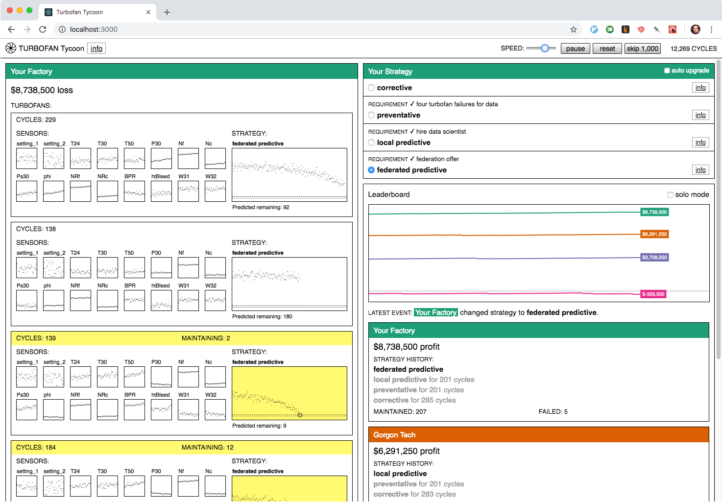
Turbofan Tycoon styling before the terminal-inspired revision.
For most of its development, Turbofan Tycoon had nearly-default-HTML-styles. Kind of like Universal Paperclips, but with a few more graphs and colors. (If you want to see its design evolution, I have a collection of work-in-progress screenshots on my blog.) The minimal styles helped focus on the numbers, but something still wasn’t feeling quite right. In a late-process revision, I switched it over to a design inspired by a different information-dense format: the computer terminal.
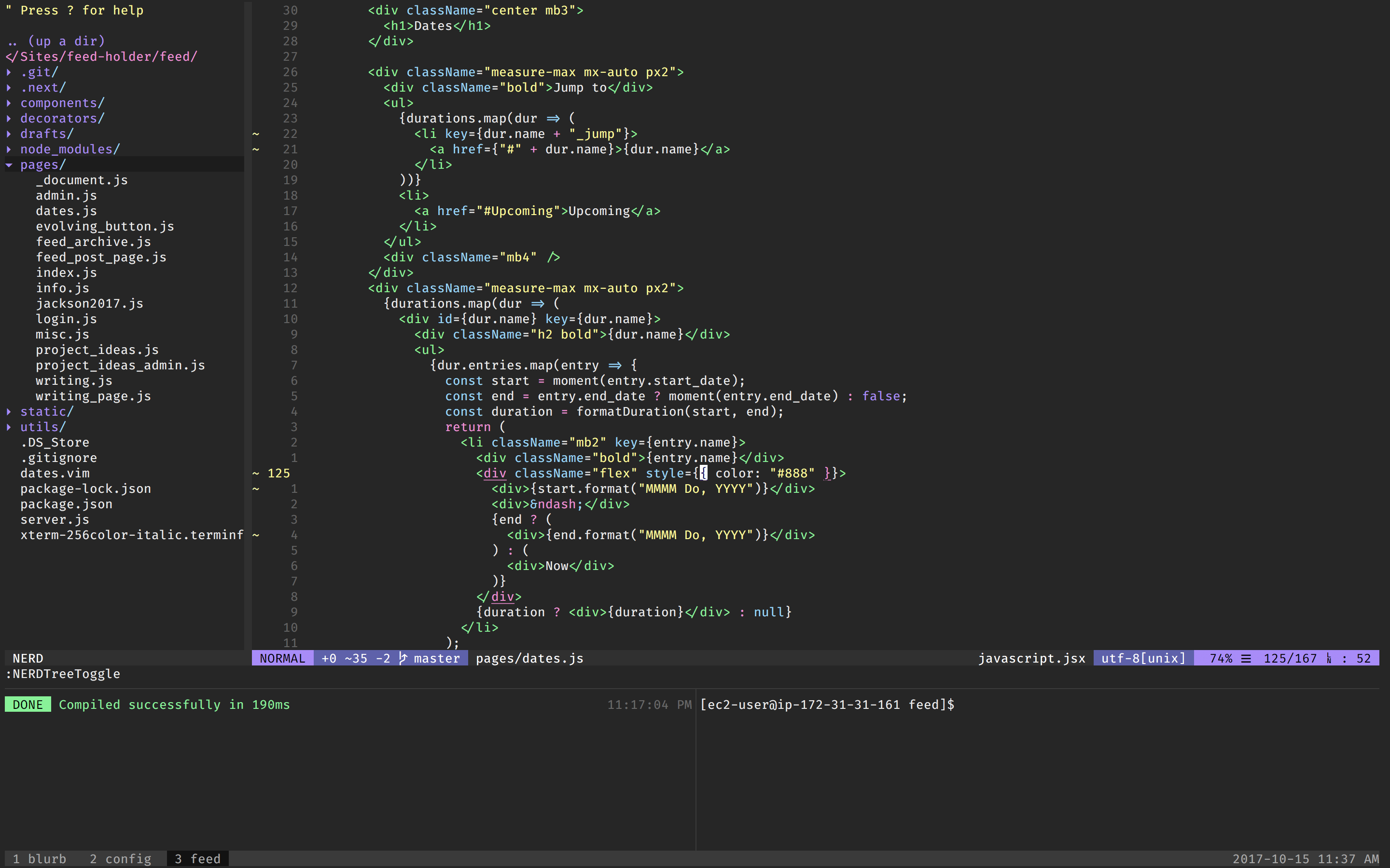
My vim + tmux set-up. A source of stability and comfort in my life. (I’ve actually since switched to VS Code.)
I’ve been fascinated by the design of terminal applications for a while. Terminals and text editors are where programmers get their work done, so a lot of the design has been through an unsentimental pragmatic filter, where the more ornamental aspects get dropped. A lot of web applications feel brittle to me, whereas Vim feels solid. My working theory is that this has something to do with character grid constraint in terminal programs. Since, as mentioned above, I was looking to put as much structure as possible into Turbofan Tycoon to balance all the data flowing through, I drew on some of the conventions of terminal programs for the revised design. (It’s more of a stretch, but somewhere in my mind were the impressive things that games like Caves of Qud and Cogmind have done with their text-based layouts.)
In practical terms, the biggest shift was moving to a monospace font: IBM Plex Mono. A monospace font automatically gives you more structure, especially for rapidly changing numbers, since the width stays constant no matter the digit (though for numbers, you can get the same effect from a proportional font if it has tabular numbers as an option). I tried to stick mostly to the same font-size and line-height, making exceptions only where I felt it really added to the hierarchy. In a weird way, the graphs also became something like monospaced as well. Each pixel corresponds to one data point (one hour) in every graph. I liked this aesthetically and it also made adjusting the graphs to responsive layouts easier. The graphs are made in HTML canvas and canvas drawing primitives (it really likes rectangles) were a good fit with the rest of the design. The minimalness of it all also helped make the use of color pop, and the terminal-inspired design made the app feel more solid and less rickety, like it could have sat running for years on a dusty monitor in a turbofan factory control room.
Turbofan Tycoon: Origins
So there you have it. Turbofan Tycoon originated from a desire to demonstrate the value of federated learning and a love of simulation games and terminal interfaces. We had a lot of fun putting it together and we hope you enjoyed this look into a part of how it was made. If you haven’t already, go try it out, and let us know what you think.

