Jan 29, 2019 · newsletter
Making an interactive UMAP visualization of the MNIST data set

UMAP explorer: an interactive visualization of the MNIST data set
We’re in the middle of work on our next report, Learning with Limited Labeled Data, and the accompanying prototype. For the prototype’s front-end we wanted to be able visualize and explore the embedding of a large image data set. Once you get into the tens of thousands of points, this can be a challenge to do in the browser. To determine whether what we wanted to do on the front-end was possible, I decided to make a demo focused on the MNIST hand-written digit data set. After some dead ends and a lot of Stack Overflow searching, it turns out it is possible, and I shared the result as an interactive UMAP visualization of the MNIST data set.
About UMAP
The UMAP algorithm is responsible for the clustering of the images in the demo. The coordinates for each data point in the visualization are from the UMAP MNIST example notebook. Check out the UMAP guides and documentation to learn more about how UMAP works.
About the visualization
I’m sharing the demo as an example of how to render tens of thousands of images mapped to data points using the three.js library. The code is available on github and can be adapted or used as a reference for doing similar visualizations with different datasets or algorithms.
I had worked through how to use three.js for 2D data visualization in our previous prototype on Semantic Recommendations. If you’re interested in how to set-up the three.js camera and get it working with d3-zoom, I recommend the notebook I wrote about that project.
Rendering the images
The visualization for the new prototype is based on that previous three.js work, but there was one thing I wanted to improve upon this time. Instead of rendering the points as dots, I wanted to display the image itself. A lot of what you want to see when you look at a clustering algorithm is how it puts together its clusters. Displaying the images themselves (rather than showing one-at-a-time on hover) gives a much better view into how the algorithm is working. I knew a bit about how textures worked in three.js from before, and I had some experience with sprite sheets from trying to optimize website image loading. I had a vague idea putting the images together in a sprite sheet (in this context known as a texture atlas) and then cropping and offsetting could work to render all 70,000 MNIST images, but I didn’t know what the real mechanics of that would look like.
It took me a while to get there, but the key turned out to be this WestLangley answer and the accompanying jsfiddle, which shows how to combine the points geometry with a texture atlas to render different images across the different points. I used that example as the starting point for this visualization. I learned a lot more about uniforms, attributes, and shaders as I made tweaks to get the results I wanted, but that example is the core of the image rendering.
Generating the images
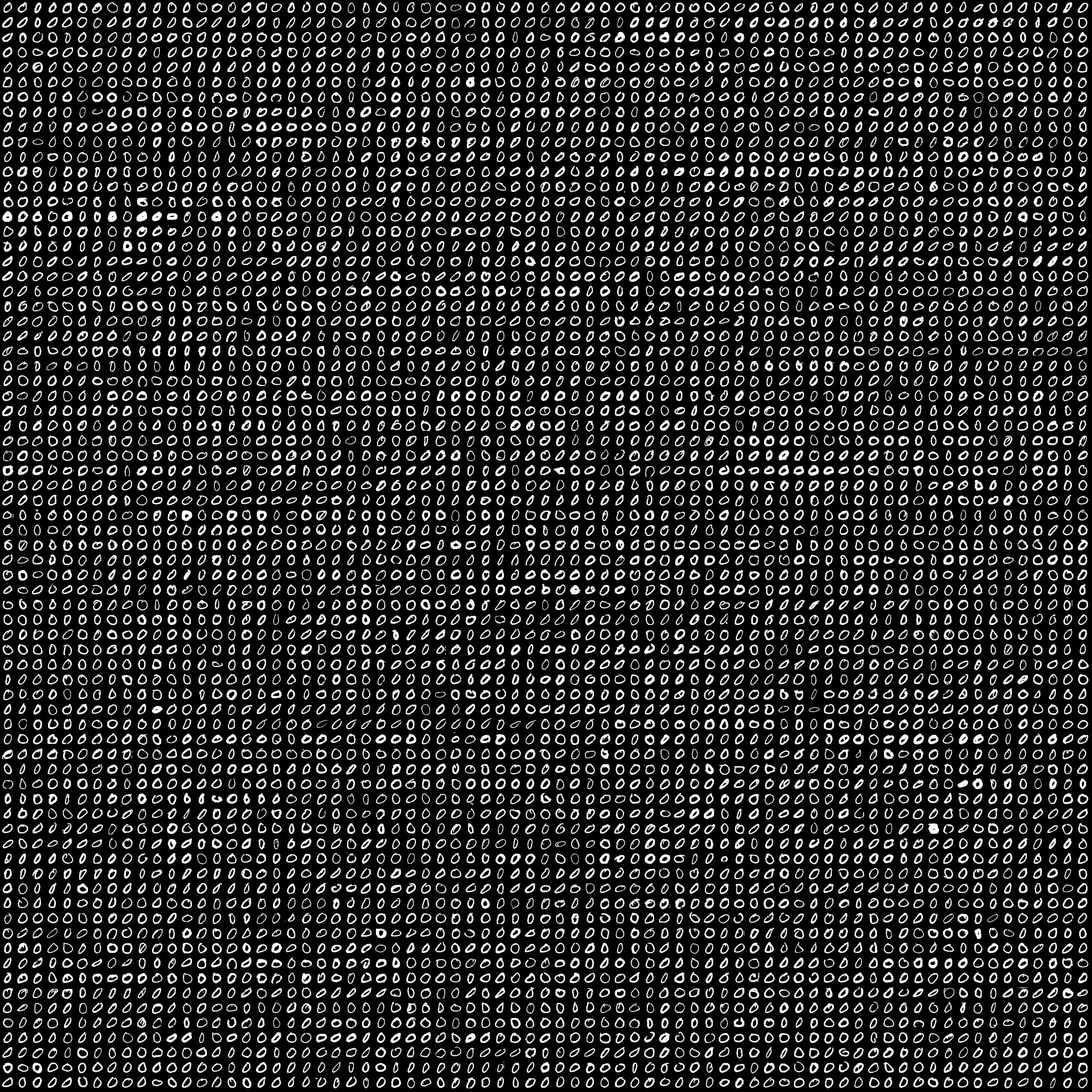
A texture atlas of one chunk of the MNIST dataset.
Another big help in making this was Douglas Duhaime’s post on using three.js to visualize TSNE maps. Finding Douglas’s post and project reassured me that I was on the right path. It also provided lots of information about texture atlases. Including the info that for some devices, 2048x2048 is the largest size allowed.
Douglas shows how to use ImageMagick to create texture atlases. For our project, I wanted to generate them in python. The prototype will have several different datasets. My co-workers are already doing their machine learning stuff with those datasets in python, so if we code out a pipeline in python to generate both the embeddings for the visualization and the texture atlases, we should be able to switch out different datasets relatively easily. We put together this visualization of the MNIST dataset to make sure that approach would work on a dataset we knew well (we didn’t want to have to debug the visualization rendering and the dataset and models all at the same time). I included the iPython notebook code for generating the images in the github repository. I’m new to python, so it’s not pretty - but it worked.
Gotchas: transparency, image size, and highlighting
In this visualization, the transparency of the digits comes from discarding color data below a threshold of 0.5. As far as I can tell, you can’t do gradual transparency with this approach. You can see the effect of this when you’re zoomed out – the darker pixels within the clusters are ones that were above the threshold but not pure white. I don’t mind the effect so much here. I was excited I could get what transparency I did. But it might be more of an issue for other datasets. For many image datasets you wouldn’t want transparency at all. I am curious how this visualization would feel with non-transparent images.
I think for non-transparent images you might want to adjust the size of the sprites even more. That gets into one of the biggest caveats about using three.js (and specifically the points object) for this type of visualization. By default the image data point is the same size no matter your zoom level (it doesn’t get bigger as you get closer, as an object would in real life). This can be a benefit; it lets you see more of the local structure as you zoom in. But you probably don’t want the points to stay exactly the same size. What you can do is adjust the size of the points as you zoom by setting the uniform. As I understand it, a uniform isn’t very expensive to update so you can do it a bunch of times on zoom. For this visualization, I set my own custom zoom scaler using d3-scale, which enlarges the size of the points at certain specified intervals. If I had more time I would definitely dial in the feel of this a bit more, but I think I got a relatively functional version in.
For highlighting, I again used an approach from my past project. Using three.js’s raycaster functionality to determine which point the mouse is over. To create the enlarged hover sprite, I actually use a different point object with very similar shader code. There’s probably a cleaner way to do this, but it works for now.
Aspirational TODOS

I recently got transitions between UMAP and T-SNE running.
- I’d love to see what you could do by switching sprite sheets for different zoom levels. If you used different resolution sprites for different zoom levels, you might get better performance. It could also be interesting to switch to something more abstract (like a circle sprite) when you’re zoomed out, and then switch over to the images only when you’re zoomed in enough that they’re useful.
- Different scaling of points on zoom. Like I said, I don’t think I nailed this part. I’d love to see someone take a more rigorous approach to it.
- (DONE 2019-01-21) Transitions between algorithms. Kyle McDonald made some GIFs of transitioning between UMAP and T-SNE. The way the shaders are set-up, I can kind of make out how you could do this (switch the position attributes, interpolate with something like tween.js), and it has the potential to look really slick.
- Try it on the fashion MNIST dataset. UMAP example here.
- Port the visualization from three.js to REGL.js.
- Constraining zoom and pan so you can’t scroll the visualization off-screen. I tried this a bit, but ended up scoping it out of this version. If I cleaned up the code for wiring d3-zoom to three.js’s camera, this would probably be easier.
- Make this a general framework for visualization. Easy, right? I think the core of this could be a really good approach for visualizing lots of datasets and how machine learning is viewing them. Making it friendly and handling all the edge cases would be a big undertaking though.
On to the prototype
I was really happy with how this demo turned out, and I’m now in the middle of applying its lessons to our upcoming prototype, which is focused on active learning. It should be a fun one.